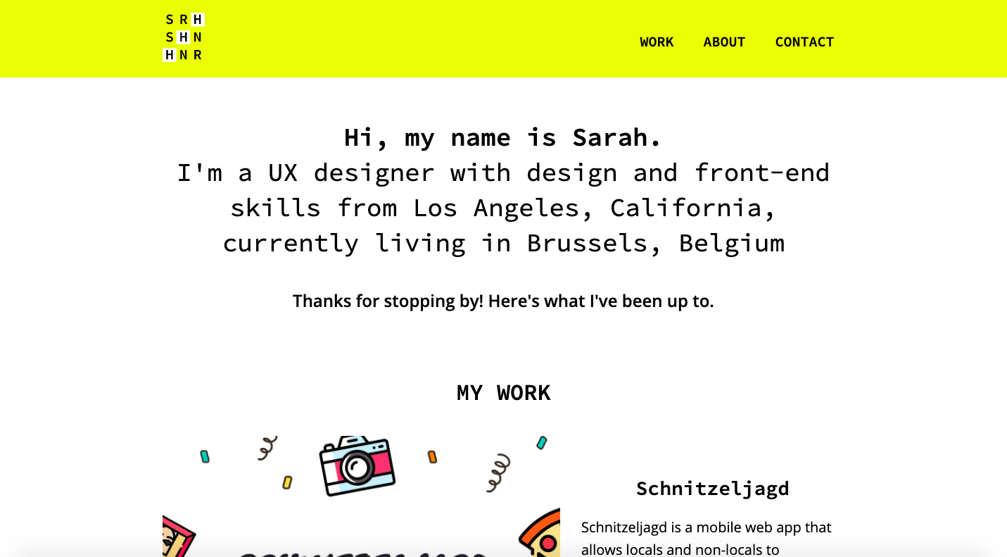
Schnitzeljagd
OVERVIEW
Role: UX UI Design
Tools: Sketch, Balsamiq, Invision
Time: 9 months
CareerFoundry course project
The problem with any scavenger hunt tends to be the time-consuming process of creating and organizing a hunt and their need to be customized to the location of the hunt. I wanted to design a location-based scavenger hunt mobile web app that provides a fun and unconventional way of getting to know a city, whether it's a familiar hometown or a new city while maintaining a social component.
DISCOVERY
I first conducted an online pre-interview survey, completed by 67 participants, whose ages ranged from 15 to 45+. These survey responses, in turn, helped form and guide my interview questions, which aimed to better understand the following:
- What aspects of scavenger hunts do users enjoy and what do they find frustrating?
- In which situations are users most likely to play a scavenger hunt mobile game?
- What type of information and experience do users want to achieve when getting to know a city, whether it's a new or familiar city?
KEY POINTS
- Majority of respondents are not eager to plan and organize their own scavenger hunts as it would be too much work.
- The key interests when in a new city tend to be the food scene, to experience life like the locals, and to learn about its history and culture.
- Majority of users would use this game on special occasions and would be less likely to play it on a regular basis.
- Participants seemed to be on the fence about playing a scavenger hunt game with strangers and female interviewees expressed safety concerns.
- A prize incentive seemed to be an important aspect when playing a scavenger hunt.
POV
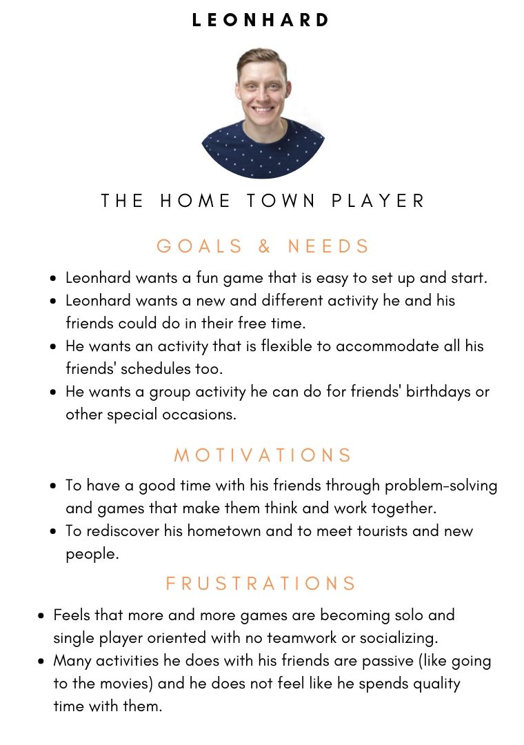
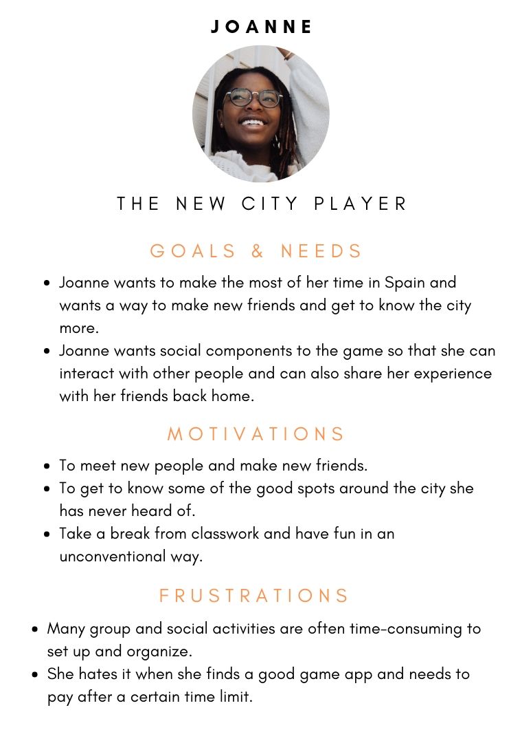
From there I created two types of personas in order to help facilitate my design process, the hometown player and the new city player. Knowing who I was designing for helped me to focus on how the app could best fit the users' lifestyles.
Because I was designing a responsive web app, I took a mobile-first approach and prioritized features that would be necessary for a mobile audience. I wanted the app to be a simple, no-nonsense platform where users can search for and participate in pre-made scavenger hunts in a given city. This meant cutting out features that allow users to organize and create their own scavenger hunts, as previous competitive analyses showed that these features were available in other scavenger hunt apps already on the market.
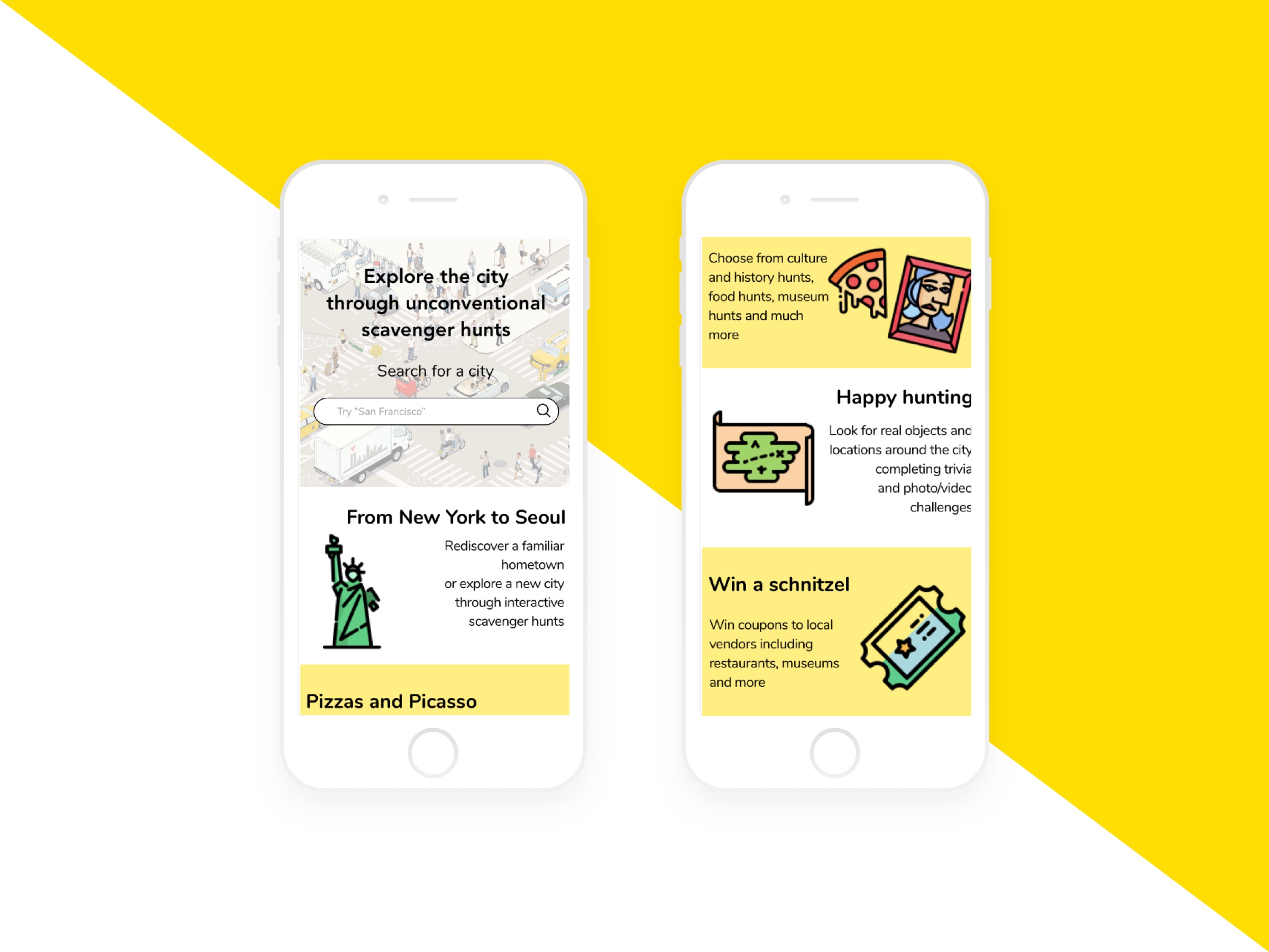
I wanted Schnitzeljagd to be an app that allows locals and non-locals alike to hunt for real objects and locations around the city while earning "schnitzels" or prize vouchers for local vendors such as restaurants, museums, and shops.
ITERATIONS & REITERATIONS
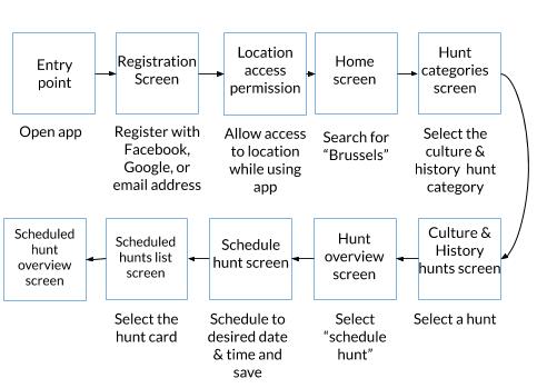
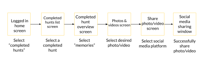
Early sketches were drawn up for three of the main pathways users would take within the app: conducting and filtering a hunt search, scheduling a desired hunt, and sharing video and photo challenge submissions. I didn't design the actual gaming aspect of the app as I wanted to focus on the core navigation experience first and foremost.
Throughout the conception and iteration phases, I had to keep in mind that I was designing a mobile web app and not a native app. Consequently, during the prototyping phase, I iterated and reiterated upon several of the elements for an optimized web browser experience.
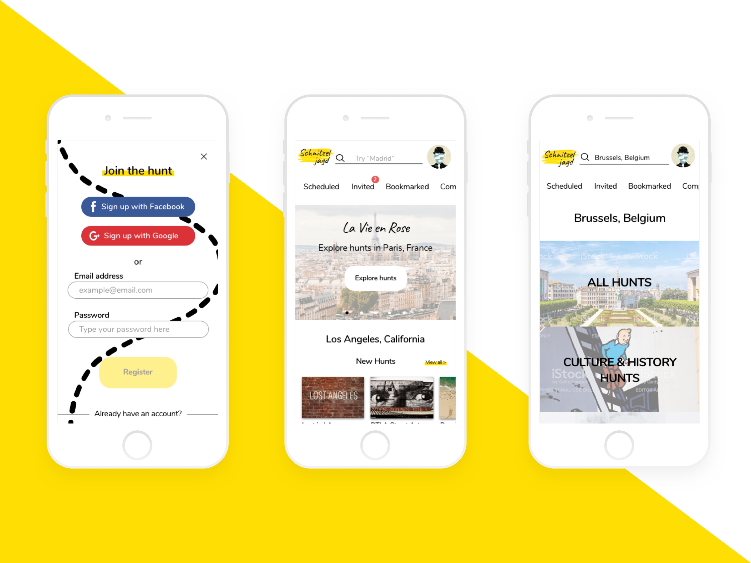
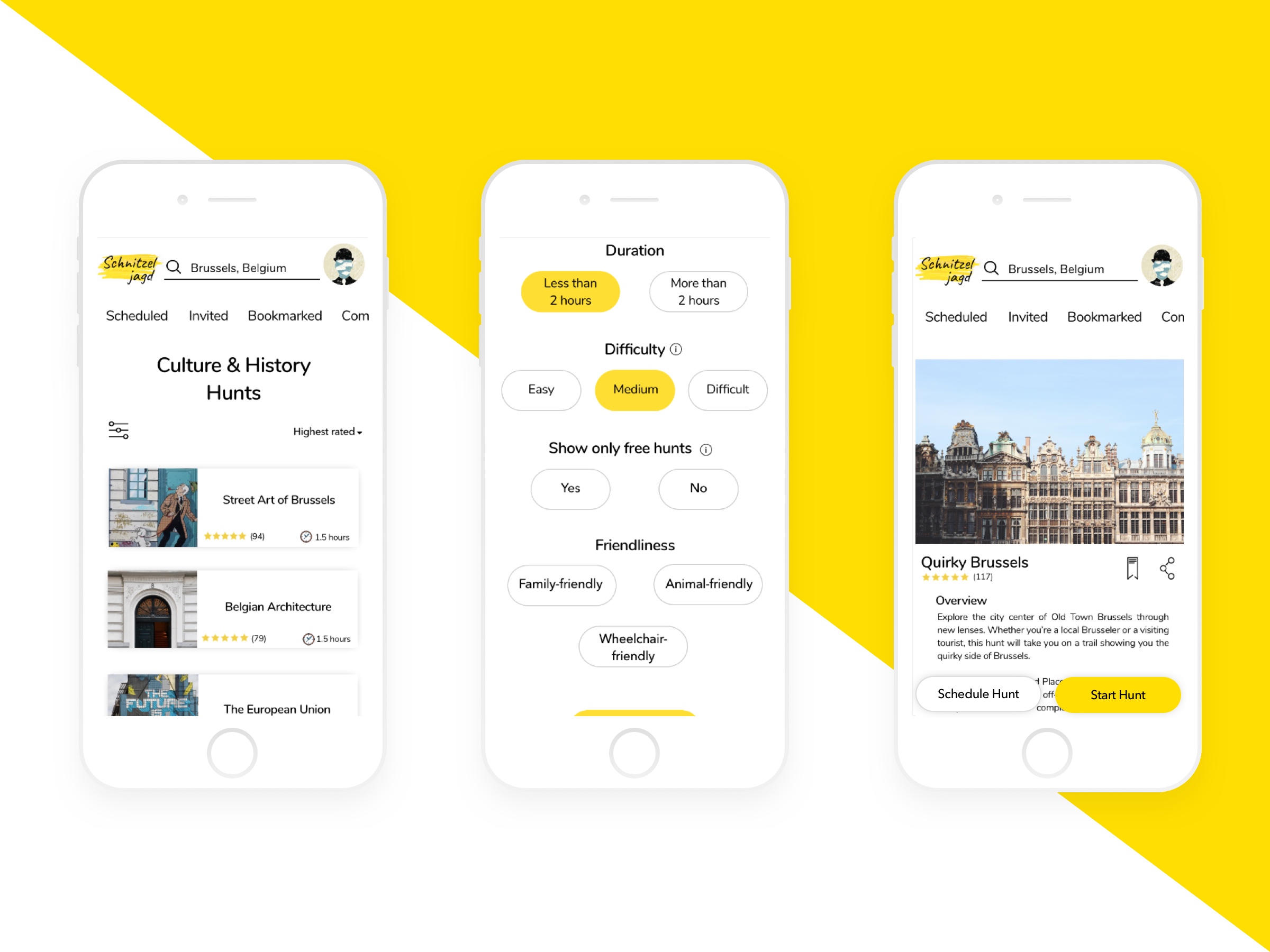
When sketching the format of the menu and general navigation, I drew a top nav bar with hunt-related buttons that users would commonly use such as upcoming hunts, hunts they were invited to, bookmarked hunts, and completed hunts. I added a dropdown menu on the left corner to hold the rest of the common navigation content.
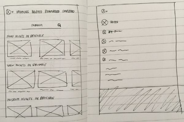
Once I got to mid-fidelity wireframes, I removed the top nav bar and moved all navigation content into the dropdown menu in order for users to be able to easily find all navigation content in one place.
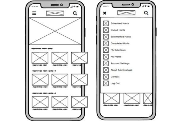
However, once I got to high-fidelity wireframes, I brought back the top menu bar with commonly used actions (scheduled, invited, bookmarked, and completed hunts) so that users were able to easily access these common actions. I then had the dropdown menu under the user's profile image on the top right corner. In the place of the previous dropdown menu on the top left corner, I had the Schnitzeljagd logo, which would act as a home button.
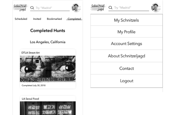
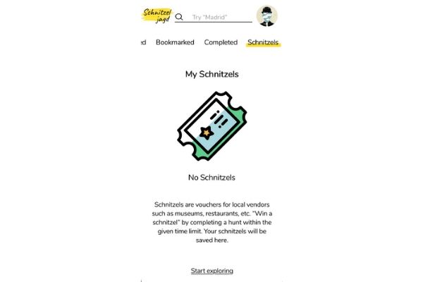
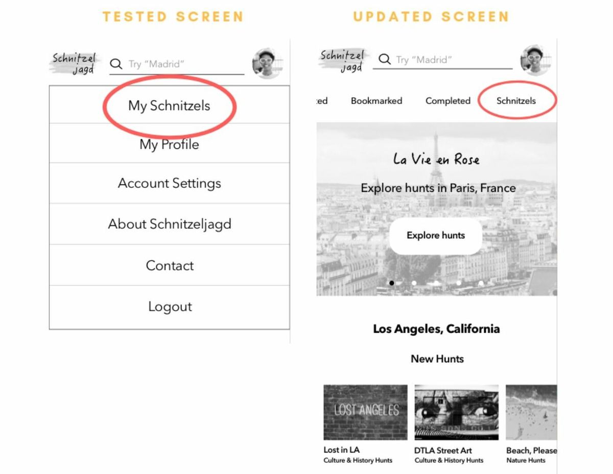
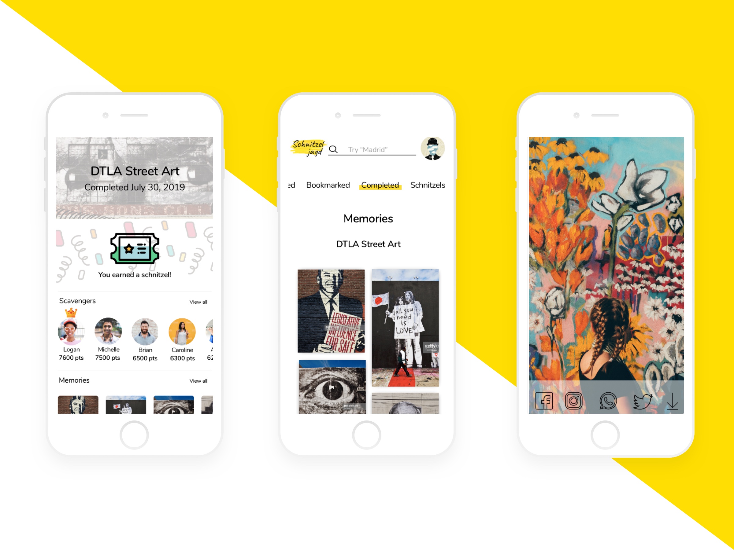
After initial user testing, I saw that some users were having a difficult time finding the "My Schnitzels" page, which was under the profile photo dropdown menu. As schnitzels are a big part of the app's concept, I moved it to the top tab menu bar, which was made horizontally scrollable to accommodate the additional element.
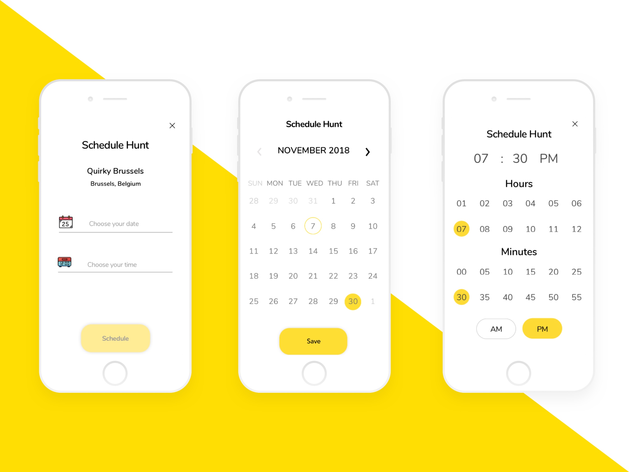
Another aspect of the app that I had to iterate upon several times was the time-selection format for scheduling a hunt.
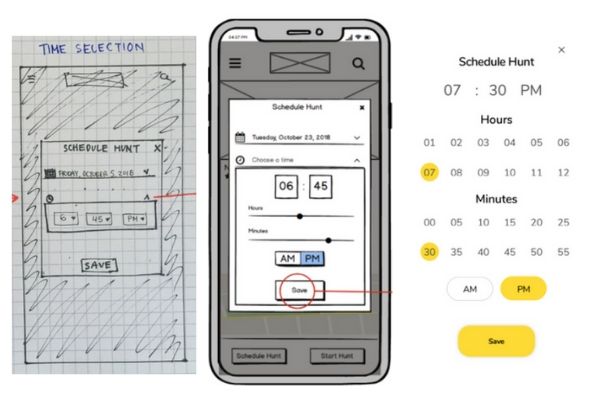
In the low-fidelity wireframes, I had a dropdown list for the hour, minutes and AM/PM. Although this format was acceptable on desktop, it was not the best for mobile users as dropdown lists are not the most touchscreen finger-friendly.
When I reached mid-fidelity wireframing and prototyping, I swapped the dropdown list for a horizontal slider, in which the hours and minutes would change as the user moves the slider left or right. This format worked well for mobile users, but I thought that it might not be the most inuitive for desktop users.
As I approached high-fidelity wireframes and prototyping, I opted for a format that would work easily on all devices in which numbers for hours and minutes were laid out for users to tap or click. Upon receiving some feedback, further changes were made to the text color of "Hours" and "Minutes" from yellow to black to make sure that all users are easily able to read the text. Once my high-fidelity prototypes were completed, I was eager to see how this format would hold up during usability testings.
USABILITY TESTING
The goal of the testings was to assess the learnability for new users interacting with the Schnitzeljagd web app for the first time on mobile. Through the usability testings I wanted to find out:
- How easily participants log in and go through the onboarding process and see if there are any confusions along the way.
- If participants can easily find the search bar to search for a city.
- How easily participants apply filters to the hunt search results.
- If the scheduling hunt process is intuitive for the participants, particularly if the time selection format is easy to understand and use.
- How intuitive is it for participants to locate photos and videos of past hunts and share them.
All six participants positively commented on the overall look and feel of the interface. All understood the main purpose of Schnitzeljagd from the home screen. When it came to the tasks, all six participants completed all of the tasks. Although there were a few confusions along the process, they were not severe enough to hinder the participants from completing the tasks. The main confusions and errors experienced by the participants are listed below.
KEY ISSUES & CHANGES
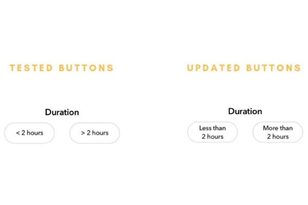
Issue 1: Participants were confused about the <2 hours and >2 hours filter buttons (high severity)
Change: I renamed the buttons from <2 hours to "less than 2 hours" and >2 hours to "more than 2 hours".
Evidence: 66% of participants experienced confusion when asked to filter hunts that were less than 2 hours in duration. One of the participants actually tapped on the incorrect button while three other participants did not make the mistake themselves but pointed out the confusing wording.
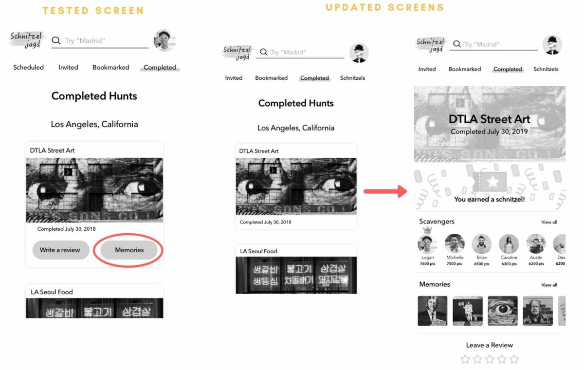
Issue 2: Participants tapped on the default photo shown on the completed hunt card to view its photos & videos instead of the button labeled "Memories" on the bottom half of the card (high severity)
Change: I removed the "write a review" and "memories" buttons from the completed hunt card and allow users to tap on the card which will take them to a new screen with more options to interact with the completed hunt including writing reviews and viewing photos and videos
Evidence: When asked to view their submitted photos and videos from a completed hunt, all participants correctly went to the completed hunts screen but from there, half of the participants tapped on the completed hunt card instead of the "Memories" button on the bottom half of the card.
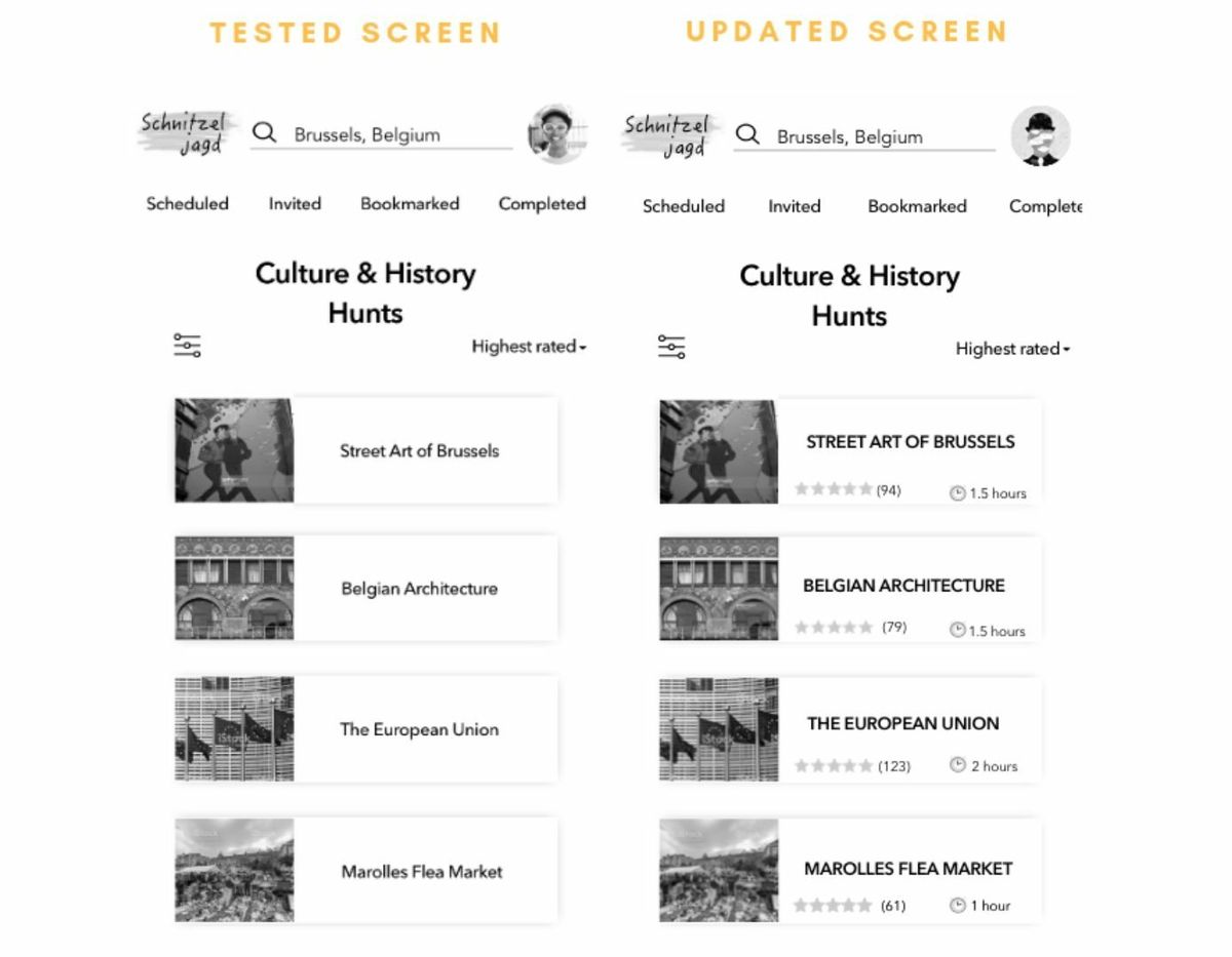
Issue 3: Participants mistakenly thought that the list showing the hunts available within a hunt category (e.g. culture & history hunts category) was a list of subcategories (medium severity)
Change: Instead merely having the title of a hunt on each card listed, I added information regarding the hunt, such as ratings, a short description and a few other elements that would give users a glimpse of what the hunt is about.
Evidence: Although all the participants were easily able to search for hunts in Brussels and chose the correct hunt category, from there 33% of the participants thought that the list of hunts shown within the chosen category was a list of further subcategories.
Issue 4: Participants thought that they would be able to view the schnitzels they've won in the completed hunt page instead of tapping on their profile photo (medium severity)
Change: I added "Schnitzels" to the tab bar on the top along with other major action buttons (scheduled, invited, bookmarked, completed) so that it can be more easily seen and accessed and made the tab bar horizontally scrollable.
Evidence: When asked where they would go to access the schnitzels they have won from past hunts, 33% of the participants tapped on the "completed" button to go to their completed hunts page.
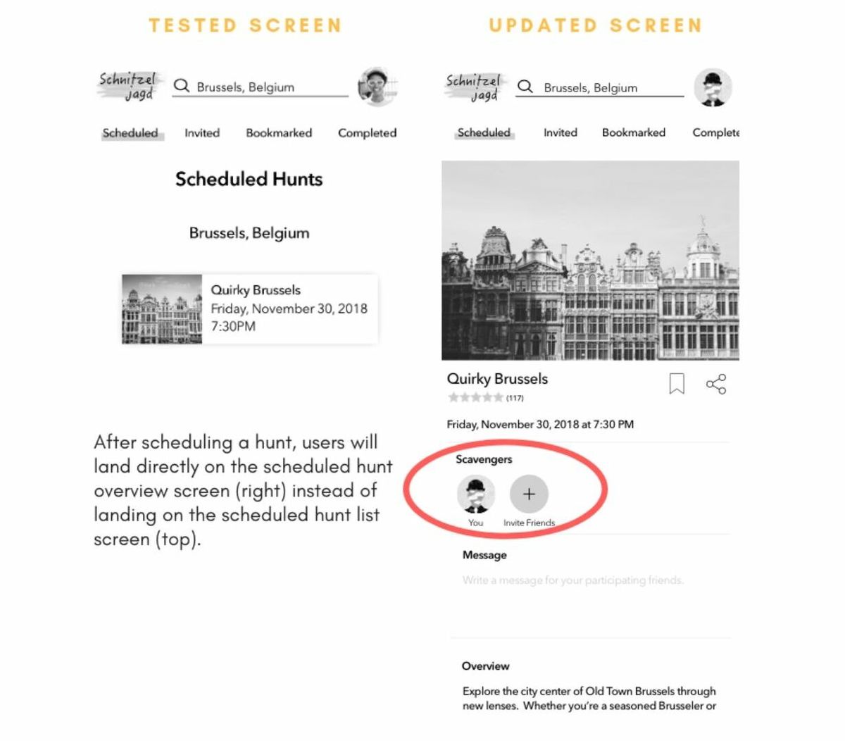
Issue 5: Participants expected to be able to invite friends somewhere along the process of scheduling a hunt (low severity)
Change: After scheduling a hunt, users land on the scheduled hunt overview screen, where they are able to easily see the options to invite friends, instead of landing on the scheduled hunt list screen.
Evidence: While or after completing the task of scheduling a hunt, half of the participants asked when they would be able to invite friends to the hunt. Only when they saw the hunt overview screen were they able to see that they can invite friends.
CONCLUSION
One of the complexities of this project was the fact that it was a gaming app. As this was my first project, I narrowed the design scope to only include the features and navigation without the gaming aspect.
For a detailed look of Schnitzeljagd, feel free to check out the final project below.
For an even closer look, check out the Invision prototype.
More Projects.
AbodeUI Design
Portfolio WebsiteHTML, CSS, Javascript
Get in touch.
Sarah Shin Honner
Product Designer