ABODE
ABODE
ABODE
OVERVIEW
OVERVIEW
Role: UI Design
Tools: Sketch, Principle, Invision, Affinity Designer
Time: 2 months
CareerFoundry course project
Buying a home is exciting and emotional. It's also an attractive path toward financial security. But it can be an overwhelming experience, especially for first time buyers who are inundated with a plethora of information online and often sink deeper and deeper into the winding rabbit hole of clicking through multimillion-dollar luxury homes they know they can't afford.
Abode helps small-scale property buyers "trim the fat" when it comes to buying a new home by providing only the essential and comprehensive information about each property and its neighborhood needed before making a decision to invest time and money on a property.
USER PERSONA & USER STORIES
USER PERSONA & USER STORIES
- As a user, I want to create a profile containing all my property criteria, so that I am recommended results most relevant to me.
- As a user, I want to search and filter properties so that I can find good matches based on my needs.
- As a user, I want to be able to save or mark properties I am interested in so that I can easily revisit them.
- As a user, I want access to as much written and visual information as possible about properties I'm interested in so that I can make an informed decision.
- As a user, I want to be able to contact the right people if I am interested in viewing a property so that I can schedule a viewing.
WIREFRAMES
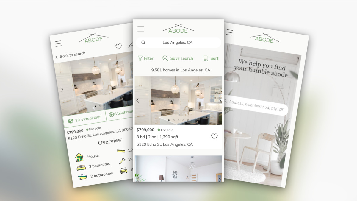
Based on these user stories, I started designing the core features of the web app.
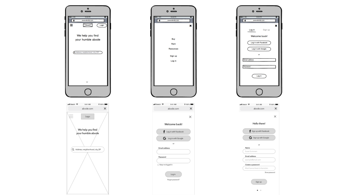
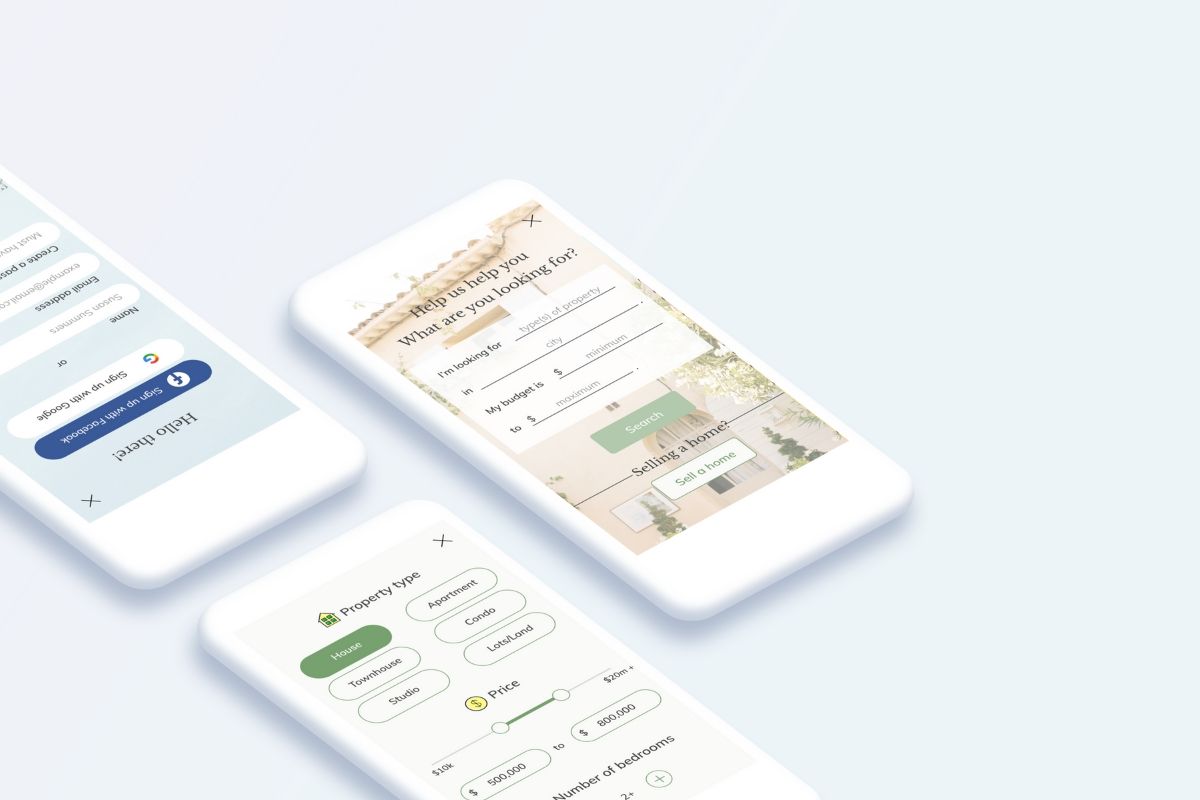
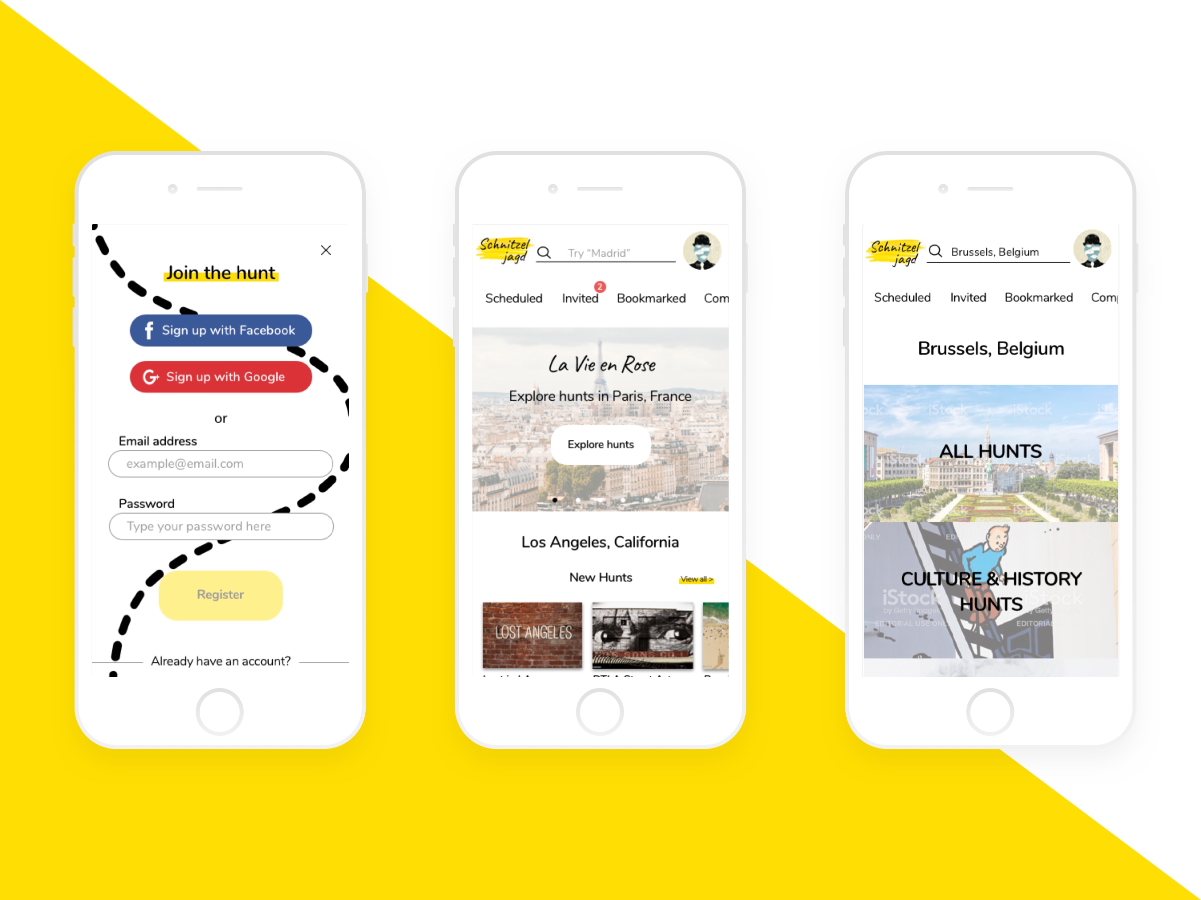
One challenge in designing for a mobile web app was the limited screen real estate (pun intended  ). When wireframing the landing page, I wanted both the log in and sign up features to be visible and easily accessible to the user. However, given the small screen real estate, there was space for only one action button next to the logo and hamburger menu button. I placed the log in and sign up buttons within the hamburger menu but I also placed the log in button at the top of the screen for easy access and visibility. When either a new or returning user selects the log in button, they are able to switch between the log in and sign up tabs.
However, once I got to mid and high-fidelity wireframing, I removed the log in button and had all menu items live within the hamburger menu to free up space. Consequently, the log in and signup screen with tab buttons was replaced by two separate screens - each dedicated to either logging in or signing up.
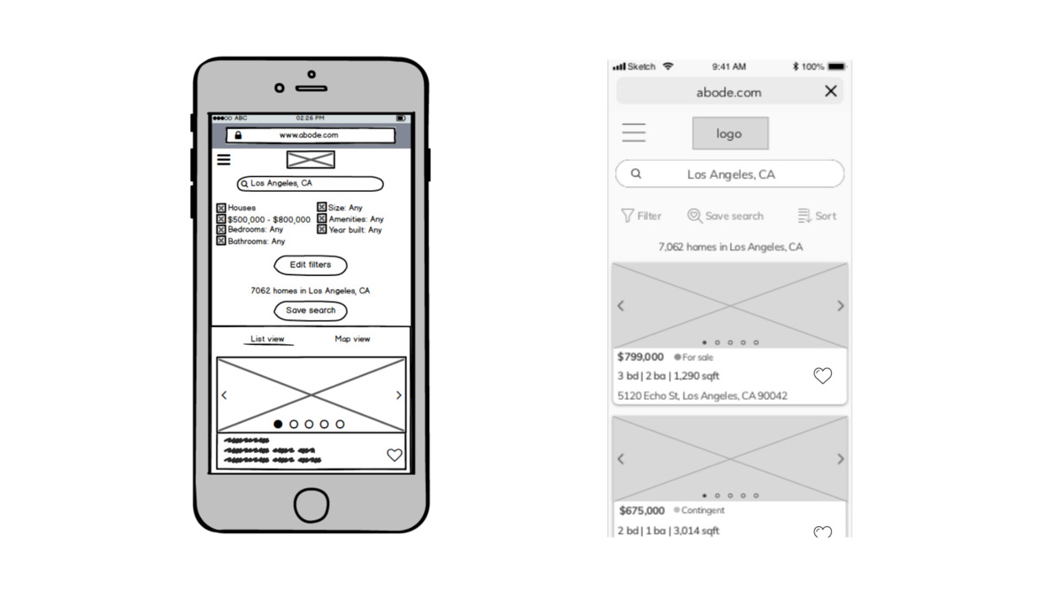
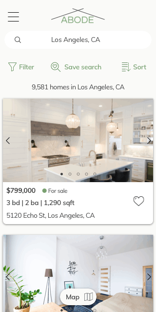
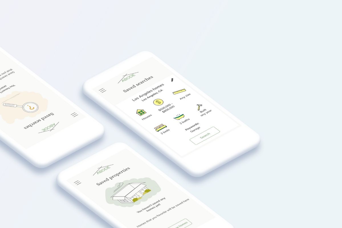
Another screen that needed several reiterations was the search results screen. I wanted to show all the filters applied to the search but it was looking too crowded with the filters and buttons taking up half the screen.
In the mid and high-fidelity stages, I removed the applied filters, as users are able to see the applied filters under the filter button. I also changed the contained buttons into text buttons in order to provide more breathing room to the top of the screen and to allow the property listings to take up the majority of the screen.
DESIGN
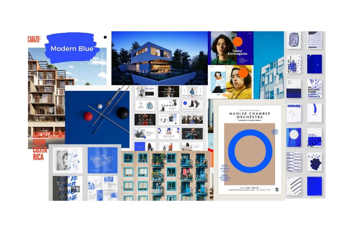
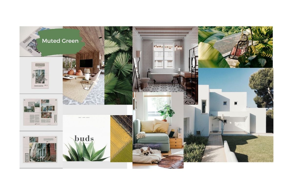
Once the structure of the app was completed, I created two distinct moodboards to establish the mood and story of the project. As this app is designed primarily for new, small-scale property buyers, I took their experience in mind when choosing the Muted Green moodboard over the Modern Blue. I wanted to give users an overall calm and welcoming feel through the interface. Although the Modern Blue moodboard looks aesthetically nice, the bright, bold colors could be overwhelming. I imagined users wouldn't want to feel overloaded with bright colors when dealing with a big decision such as choosing a property to invest in. The green palette conveys calm and soothing emotions that can help the user experience to be a little bit more relaxing.
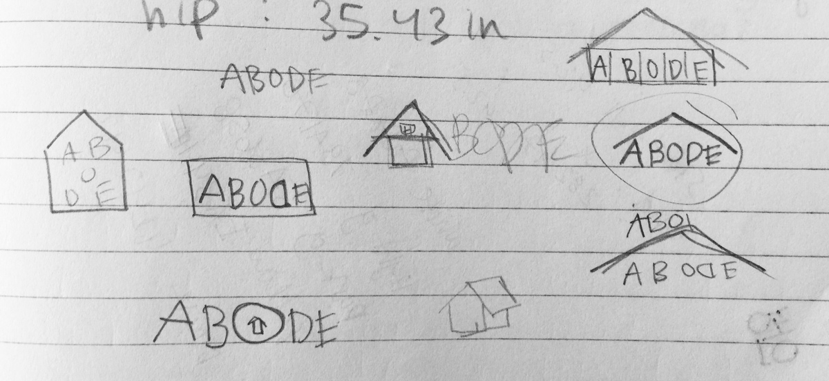
I then started sketching some ideas for the logo. I first started with the idea of somehow incorporating the symbol of a house into the logo. At the same time, I wanted the logo to look clean, simple and modern. After drawing a few sketches, I committed to one of my designs circled below.
DESIGN SYSTEM
DESIGN SYSTEM
Below is a snapshot of the design guidelines for Abode. To view the full design system, click here.
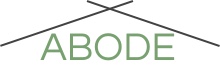
ABODE LOGOTYPE
The Abode logotype is on the top of every web app screen.
Typeface: Questrial
Colors: The text is in primary green (#78A170) and the two lines are in dark gray (#424242) against a transparent background.
ABODE SYMBOL
The Abode symbol is at the footer of each web app screen.
Typeface: Questrial
Colors: The "A" is in white (#FFFFFF), the background circle is in the primary green (#78A170), and the two lines are in dark gray (#424242).

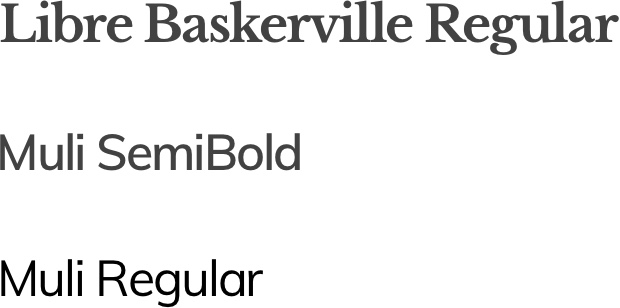
FONTS
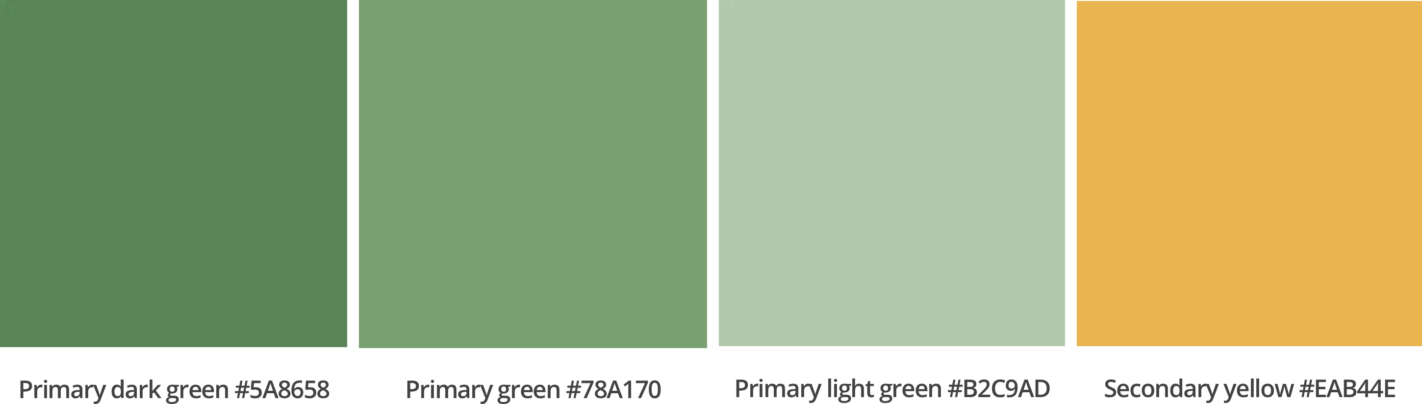
PRIMARY & SECONDARY COLORS
Primary & Secondary Colors
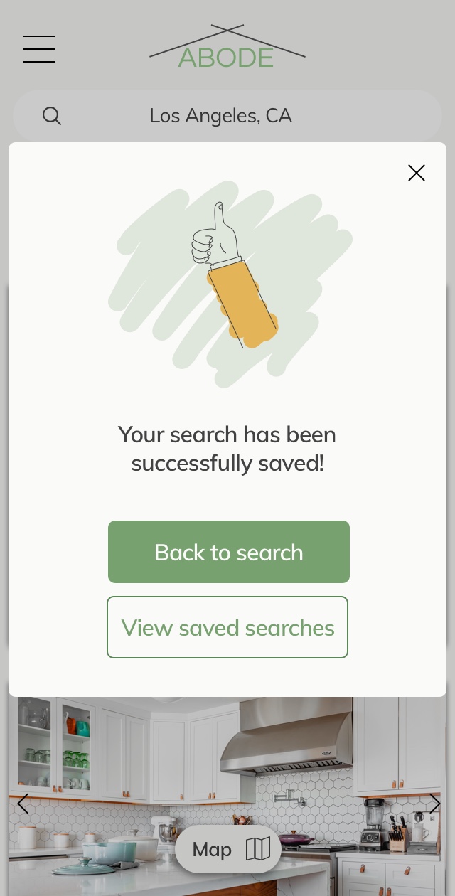
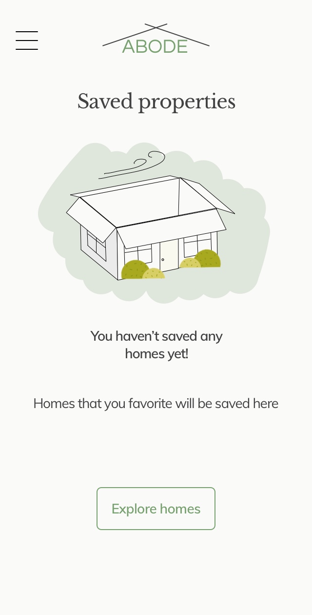
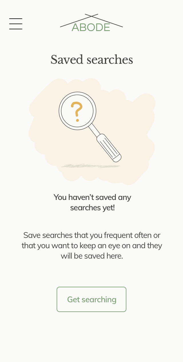
ILLUSTRATIONS
Illustrations
Illustrations are thin line drawings with light, pastel-colored fills and are used to communicate to our audience on a more specific level such as on confirmation pages and empty state pages.
INTRODUCING ABODE
More Projects.
SchnitzeljagdUX UI Design
Portfolio WebsiteHTML, CSS, Javascript
Get in touch.
Sarah Shin Honner
Product Designer